This is a guest post for http://www.zestee.com.
Undoubtedly photo editing in the present digital space offers simple and effective maneuvers to get to your desired effects. Often fixing exposure or balancing contrast or adding backgrounds can just be done with few clicks but simultaneously this array of go-easy options increases the chance of making mistakes that cost our entire effort. As photographers we boast an art form rather than technical gizmo and there are some delicate aspects of image editing that you cannot take lightly if you wish your effort to produce best effect. Here are 10 image editing blunders that you should be aware of.
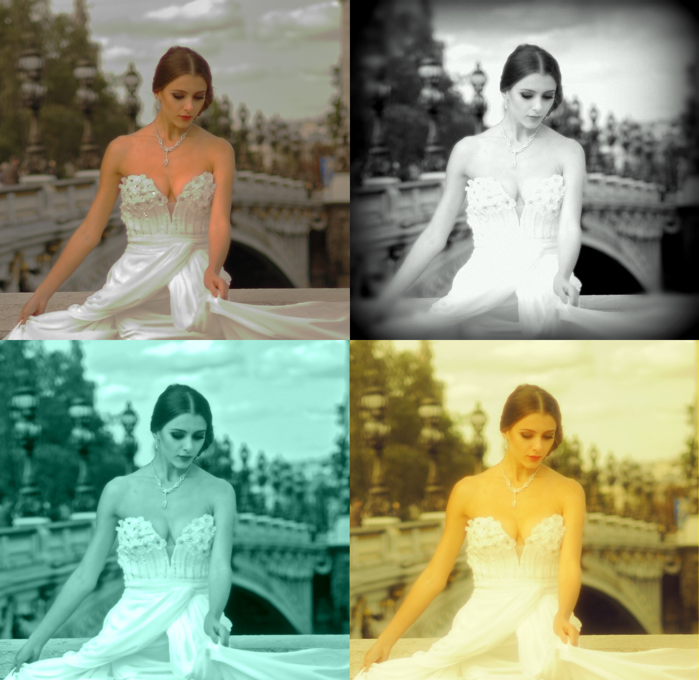
1. Over saturating colors
Sometimes when the colors in an image looks too dull or lifeless, a little pushing towards the saturation level can let the image come to life. But over saturating it just make it lose the charm. While being observant and while working constantly watching the effects from a distance can be a good way to judge the saturation effect, seeing similar photographs with good color effect can sometimes really be helpful.
2. Bad use of filters
Filters are a good way of slightly aggravating the effects of an image by neutralizing the colors or by making a color scheme gain more prominence. But the effects cannot alter the original lacking in the image itself and so a dull image can look even duller after using a filter. Moreover, among the great array of available filters only a few would ultimately come to your aid depending upon the scope in the respective image.
3. Over brightening the image
A bright image definitely attracts the viewership than a blunt one and so brightening an image to a few notches sometimes proves rewarding. Over brightening can make the image lose details and even can make the lighter shades in the image burned out. So while brightening, know when to retrace a few steps back to keep the details of the image intact.
4. Tones over adjusted
An image lacking delicate details or contours in different textures or shades do not evoke interest and over adjustment of tones sometimes can contribute to it. Sharp tones often let the natural difference of colors in objects disappear and thus the image may look a bit artificial or with imposed effect. Be aware when adjusting tones that over doing it can make the image suffer from subtlety and natural variation of tones.
5. No Whites or Blacks
Generally an image becomes benefited from the black or white areas in it, though exceptions are also not rare. Actually the images get their lively appeal and prominence from these two extreme colors. While editing, you can always check the aspect by setting up the black and white point in the Levels control.
6. Crossed curves
The capability of different photo editing software for Curves controls vary significantly though Photoshop is the best option with more powerful controls. The image curve is crucial for number of editing results including banding, uniformity of grey patches and introduction of wild colors. Curves panel offers you to adjust the brightness of pixels of a particular luminance as required corresponding to the image. You can push the diagonal curves to brighten the image corresponding to the luminance in the image.
7. Oversaturated Monochrome toning
Obviously the conversion of an image into monochrome can let you experience far better effects than standard monochrome settings available with any digital camera. The black and white adjustment controls available with Photoshop can be great aid to adjust the brightness of the colors to reach an effect akin to natural one. Here also over toning can let the monochrome lose its subtlety and texture and so be aware of pushing the tones too further.
Secondly, when adding colors to black and white images remember the color should not look as an imposed effect. To let such monochrome toning with colors give a natural effect, keep toning on the lower side. A tint of color can make your perfect sepia images instead a full color.
8. Repeating Patterns in Cloned Areas
While editing an image using Photoshop’s Clone Stamp Tool you can take patch from one area and keep it sampling in all areas that you are editing but this obviously results in repeating patterns across the cloned areas. Instead you can sample patches from different areas to make it look more natural.
9. Poor Selection or Masking
The photo editing skills are ultimately to optimize the image with desired effects without giving any indication of the editing done to achieve this. So the dodgy edges, halos or effects that leave the marks of editing on the image undermine the image quality. When editing an area of image involving fine details like hair use mask controls to select the area scrupulously so that it does not leave the marks of editing work.
10. Over-Use of Selective Color
While editing an image often we go under the spell of selective colors that appeal to us more than others and the edited images bear the consequence being partial to some colors or in many regards looking deviated from their natural look. So always be aware of the demands of the image in question from all pictorial aspects and try to adjust the brightness and toning accordingly.
About Author: David is a passionate blogger and technology enthusiast. He has recently worked for veprit’s photo sense for Mac version.
